

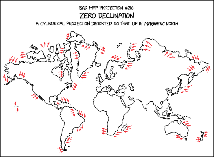
xkcd #3207: Bad Map Projection: Zero Declination
Title text:
‘The zero line in WMM2025 passes through a lot of population centers; I wonder what year the largest share of the population lived in a zone of less than 5° of declination,’ he thought, derailing all other tasks for the rest of the day.
Transcript:
Transcript will show once it’s been added to explainxkcd.com
Source: https://xkcd.com/3207/
I don’t think I have ever needed the ExplainXKCD more. I hope it’s a good one.
Edit: Darn, it doesn’t look any worse than Mercators to me.
Edit2: ExplainXKCD works while I sleep. Looks like @darkcloud@lemmy.world figured it out below as well.
Magnetic north is variable, and curved. It’s not even accross continents and changes over time. So the map is distorted so that up on the 2D plane of the drawing is magnetic north… Meaning all the countries and shapes are distorted so that magnetic north at those locations matches up in the drawing.
They’re drawn so that magnetic north is the top border of the image.
I think the red arrows are pointing out how shapes are being deformed, because the changes are relatively subtle.
The most obvious one for me (maybe because I live there…) is that NZ is basically vertical, rather than being on a big angle.
I find it more astonishing that NZ is depicted at all.
https://youtu.be/HSRmfNDk87s
Related video you might like