You must log in or register to comment.
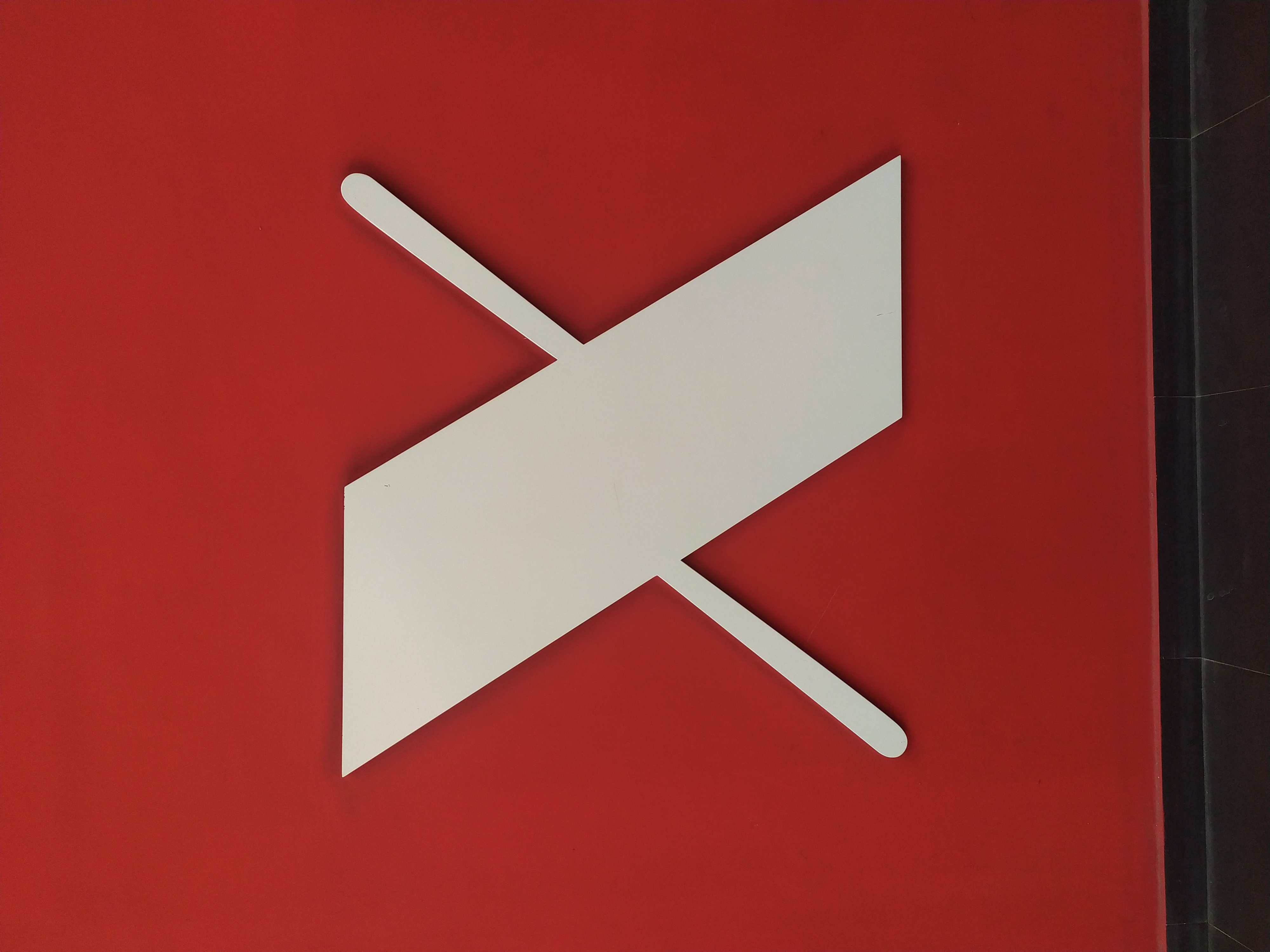
Reddit’s new logo
If you mean that it isn’t centered in the pic it would also infuriate me. Like all other non centered logos
I think they mean that the narrower crossbar is not a single straight line.
More infuriating is that it’s the wrong way around. The flat ends are the top and bottom, not the sides. Of course it looks bad like this.
Yea, in making a mildly infuriating post they have made it even more infuriating.
Yeah i meant the narrower crossbar, but the image was flipped somehow and came out wrong when i uploaded it
For some reason the combination of pointed corners on the wide stroke and rounded ends on the thin strokes bothers me.
It implies two sides of a thicker line.